11 Black Ink, White Feelings: Early Modern Print Technology and Anti-Black Racism
Averyl Dietering
What is the influence of early modern English print and print technology on the development of anti-black affects in English culture?[1] Bringing together the fields of book history, premodern critical race studies, embodiment studies, and Afro-pessimism, I argue that the anti-black racism in England that fueled the growth of the transatlantic slave trade and the British Empire was, in part, informed by representations of black figures in print media. I trace this genealogy not to propose a grand narrative of race or racism, but to consider the technology and materiality of print as an under-theorized factor in the growth of white supremacy and global anti-blackness. I examine the materiality of early modern English print, and print illustrations of black bodies in early modern texts, to show how print illustrations of blackness were deployed to foster the growth of a white English identity that defined itself in opposition to blackness. The materiality and technology of print and print illustrations informed English readers to see black bodies as non-human. Further, illustrated black bodies were used to produce anti-black affects essential to English identity, especially as Englishness in the early modern period begins to become more associated with the racial identity of whiteness.
In early modern England, bodies and texts were imagined as having meaning and being legible in similar ways. The process of reading a text was often used as a metaphor to describe reading a body, such as Thomas Browne’s description of physiognomers who could “spy the signatures and marks of mercy: for there are mystically in our faces certain characters which carry in them the motto of our souls, wherein he that cannot read A.B.C. may read our natures.”[2] The body was also used as a metaphor for reading texts, such as the popular skin-as-frontispiece trope that Claudia Benthien traces in early modern anatomies.[3] In this visual trope, the frontispiece of an anatomy was designed to look like an anatomized body holding open its skin to reveal the anatomy text underneath, drawing a comparison between turning the pages of the text and peeling back layers of human flesh. With the growth of print in England, the connections between reading texts and reading bodies were informed by the technology of print: bodies were seen as imprinted/pressed with meaning. The metaphors of print technology used in The Winter’s Tale describe the familial similarities between Leontes and his infant daughter Perdita — “Although the print be little, the whole matter / And copy of the father”[4] — and between Polixenes and his son Florizel:
Your mother was most true to wedlock, Prince,
For she did print your royal father off,
Conceiving you.[5]
In these passages, bodies become texts and texts become bodies. Further, print technology also transformed the illustrations that accompanied printed texts, as the process of illustrating a text through woodcuts or engravings was more similar in form to printing than to painting, drawing, or sketching. Thus, when an early modern reader saw an illustration of a person in a text, they were using their body (also imagined as a text) to read a text (also imagined as a body). The illustration of a body, in turn, was metaphorically also a text, while as a printed illustration, it was also literally a text. These close metaphorical connections between physical bodies and printed texts and illustrations helped to shape the early modern English imagination of what bodies could be: legible, meaningful, containing truth and knowledge — but only to those with the skills to read them correctly.
As the body and printed texts and illustrations stood as metaphors for each other and became entangled with each other, racial formations informed this entanglement. With the exception of a few scholars whose works I engage with later in my argument, these connections between print, bodies, and race have gone largely unnoticed in studies of book history and the history of print. And yet, just as the technology of print informed early modern understandings of bodies, the technology of print also informed early modern understandings of raced bodies.
Print Technology and the Transition to Black and White
Prior to the printing press, the vast majority of illustrations in illuminated manuscripts were hand-drawn or hand-painted. With the advent of the printing press, print illustrations were more likely to be printed along with the text, as it was faster to produce many illustrations by pressing the same woodblock or engraved plate repeatedly than by drawing the same illustration over and over. Both printed text and print illustrations are composed of lines that are organized to make meaning. What allows the reader to regard them as different from each other is context. For example, readers use context clues to decide if a short, straight line is part of an alphabetical letter, is one of many hatches and cross-hatches used to make a shadow, or is part of a nose on an illustrated face. Readers distinguish between these different types of lines so quickly that they often fail to acknowledge their material similarity: everything that is represented in early modern print — from the alphabetical letters to all kinds of illustrated images — consists of organized gatherings of legible lines. Furthermore, print text and print illustrations both share material similarity as legible lines of dark ink on a lighter page. Illustrators of illuminated manuscripts could portray visual elements such as color, shadow, depth, and texture with a variety of pigments, materials, and artistic techniques. But in print illustration, all visual elements must be represented by dark ink lines on a lighter page.[6]
Metaphorical Text-Bodies: The Invisible White Body, the Inky Black Body
The trope of comparing texts and bodies was not new to the early modern period, but the shift from illuminated manuscripts with polychromatic pigments, to printed texts imagined through an oppositional binary of black ink and white page, altered the way texts and bodies were compared to each other. In Act 4, Scene 3 of Shakespeare’s As You Like It, Rosalind, dressed as the young man Ganymede, receives a letter from Phebe, a shepherdess who has fallen for Rosalind-as-Ganymede, and is angry that the young man does not return her affections. Surprised at the ferocity of Phebe’s words, Rosalind declares
[ … ] Women’s gentle brain
Could not drop forth such giant-rude invention
Such Ethiope words, blacker in their effect
Than in their countenance.[7]
Rosalind’s description of these “Ethiope words” draws connections between ink, Ethiopian bodies, negative emotions (“giant-rude”), and the color black. Yet, the function of black here is not simply as a pigment, but as an expression of hyperbole: the words are so “giant-rude” that their effect is “blacker” than their “countenance,” which alludes to early modern adages that imagined both ink and Ethiopians as the blackest of black. In “Inkface,” Miles P. Grier argues that the “black and white idiom of the print-based ink culture through which [Europeans] forged ties, conducted business, and claimed possession” “rewr[o]te the semiotics of servitude.”[8] In this new semiotics, to be associated with black ink was to “designate [someone] as one who could never be an insightful reader because [they] were meant to be read by a white expert.”[9] The roles of literate reader and legible text could not be reversed. Grier notes: “The idea that ‘blacks’ might have something knowledgeable to say about ‘the ways of white folks’ became as preposterous as imagining that letters could turn around and offer an interpretation of the page on which they stood.”[10] In Grier’s formulation, white, unlike black, “was not a color to be analyzed; it was a mere background, a platform serving as a chromatic foil so that signifying black characters could stand out.”[11] In this way, the page, associated with the English body in contrast to the ink associated with the Ethiopian body, could both exercise its power of interpretation over inky black characters while also erasing and obscuring its own power when necessary.
This particular kind of anti-blackness grants the white page expansive interpretative freedom, predicated on black ink’s inability to interpret itself or signify anything other than rude, negative emotions. For example, the white page can also symbolize potential, as in this description of Belphoebe from Book II of Spenser’s The Faerie Queene:
Her yuorie forhead, full of bountie braue,
Like a broad table did it selfe dispred,
For Loue his loftie triumphes to engraue,
And write the battailes of his great godhead:
All good and honour might therein be red:
For there their dwelling was.[12]
Belphoebe’s ivory forehead is a surface for Love to engrave, yet the poetic syntax — “For Loue his loftie triumphes to engraue” (emphasis added) — makes it clear that the engraving has not happened yet. Not to mention that if it had, her forehead would not be ivory. Just as Shakespeare’s Rosalind associates blackness with ink, Ethiopian bodies, and negative emotions, this description of Belphoebe associates whiteness with the page, English bodies, and positive emotive words such as bountie braue, Loue, and good and honour. Thus, the English body becomes associated with the whiteness of the page: a page that is imagined not as empty or lacking, but more positively as a blankness that is full of potential. And even if there is no mention of black bodies or black ink in the description of Belphoebe, the association between the whiteness of the page and its blankness as a positive potential is not possible without the anti-black reading of black bodies and ink as full of negative emotions and lacking interpretative potential.
What I find interesting about these references, aside from the use of print metaphors to link English bodies to whiteness and African bodies to blackness, is that neither reference acknowledges that legibility is dependent on the high contrast between black ink and white page. Black letters are not legible on just any type or color of background; it is the contrast and interplay between ink and page that makes words legible. Yet in both Rosalind’s critique and the description of Belphoebe’s forehead, legibility and meaning are imagined as residing within black letters; the white page underneath them seems almost to disappear. I address this to point out that although print technology presented English readers with new opportunities to assign value to skin color, the values that they assigned should not be considered as predetermined by this technology. On the contrary, the associations made between ink, paper, skin, and race in As You Like It and The Faerie Queene show that the interplay between ink and page to produce legible text — which could have produced many different ways of thinking about the relationship between skin color, meaning, and value — was overdetermined by the anti-blackness of early modern English culture.
Locating Emotions in the Inky Body, or, How to Read for White Feelings
The examples from As You Like It and The Faerie Queene demonstrate the growing associations between the color black, ink, African bodies, and negative emotions on the one hand, and the connections between the color white, the “blank” page, English bodies, and positive emotions on the other hand. Print illustrations of black bodies and white bodies — illustrations that, by the nature of print technology, must be made up of the binary contrast of black ink and white page, even if the body represented is meant to be represented as ivory white or completely black — show the influence of print technology on early modern English racism. To develop these ideas about the influence of print technology on early modern English racism, I turn to three illustrations from canonical early modern texts.
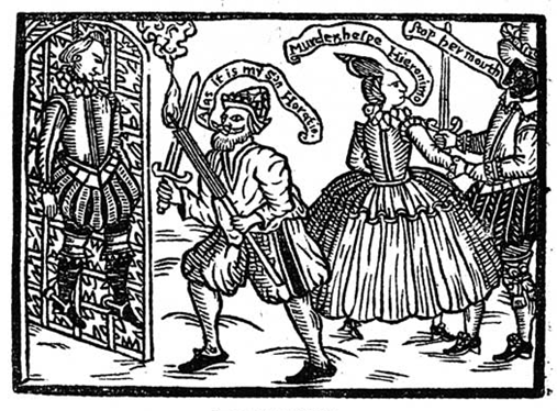
The frontispiece of Thomas Kyd’s The Spanish Tragedy shows how early modern English illustrations that flood skin with black ink often result in faces that appear comparatively rudimentary, difficult to read, and lacking in nuanced emotion (Fig. 1). The woodcut conflates moments from Scenes 4 and 5 of Act 2 to show Hieronimo discovering the murdered body of his son Horatio. On the right, Bel-Imperia, who is Horatio’s lover and the daughter of the King of Spain, calls for help while Lorenzo, Bel-Imperia’s brother, tries to stop her from crying out, as he fears she will reveal his role in planning and carrying out Horatio’s murder. Unlike the other characters, Lorenzo has a black face. Scholars have argued that Lorenzo’s black face could refer to many English beliefs about the Spanish, such as the Black Legend genre of anti-Spanish propaganda very popular in England, or associations that the English made between Spaniards and Moors. Given the stage direction in Scene 4 that calls for Lorenzo to be “disguised,” it could also be that he is in blackface or wearing a black cloth mask.[13] This possibility introduces the meta-theatrics of portraying race on the early modern stage, as a black cloth mask could be used to signify both a disguise and, as Ian Smith has shown, black skin.[14] My point is not to determine which interpretation is correct, but to show how these possible interpretations repeatedly show growing connections between the color black, ink, dark skin, and negative emotions. I also want to draw attention to the fact that Lorenzo’s face, compared to the other characters’ faces, lacks a great amount of detail. The other characters have eyes, noses, mouths, eyebrows, and facial hair, with enough detail in these features that it is possible to read a general expression of alarm on Hieronimo’s face and anger or fear on Bel-Imperia’s face. But Lorenzo only has eyes and a nose; there is a white space near where his mouth should be, but whether that represents his mouth or is just a flaw in the imprint is unclear. His emotions might be guessed from his physical actions or his words, but not from his face.
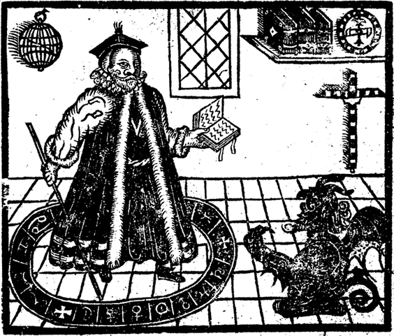
The frontispiece of Christopher Marlowe’s Doctor Faustus develops difficult-to-read inky black skin in a new direction through the figure of the devil Mephistopheles, whose emotions are not necessary to read because he is already assumed to be malignant and evil (Fig. 2). A devil is on a different register than a racially othered body, and yet there is an undeniable connection drawn in this image between evil and black skin, as well as the lack of detail in the illustration of the devil. Faustus, for his part, gets detailed facial features, even some hatching on the sides of his face that show shadow and dimensionality. He gazes up and out, his expression serious and determined. Again, the illustration of the devil is comparatively rudimentary. While he has more identifiable facial features than Lorenzo, there is not enough detail to guess his emotions. Like Lorenzo, the black skin stands in for an always already assumed negative affect and evil desire. Like Horatio, Hieronimo, and Bel-Imperia, Faustus’s white skin signals a character that readers can identify, or with whom they might empathize.
Lorenzo’s face and Mephistopheles’s body are illustrated with solid ink, while details are done in white page, in what is known as the white line style of woodcut printing. In this style, lines are carved into a woodblock to create an image, then ink is applied to the woodblock so that when pressed, the ink appears on the page everywhere except for the lines of the image. Despite the crudeness and lack of detail in Lorenzo’s face and Mephistopheles’s body, the white line style is not an inherently simple or unsophisticated art. The incredible detail possible in the white line style is clear in the Standard Bearers series of white line woodcut prints by Urs Graf, who is credited with popularizing the white line style in the early sixteenth century. However, in print illustrations in England, the white line style seems to have been an underdeveloped technique compared to the black line style, in which Horatio, Hieronimo, Bel-Imperia, Faustus, and most of the other objects of the woodcut prints are illustrated. The black line style is a relief printing technique that is essentially the reverse of the white line style: instead of carving lines into the woodblock to form an image, the artist carves away everything but the lines that form the image, so that when pressed, the ink will only appear on the page as the lines of the image. The unequal development of these styles meant that a face portrayed in the white line style did not have as much detail and depth as a face portrayed in the more established black line style. Because faces in the white line style were read as racially black, this meant that black bodies, especially black faces, chronically lacked detail and depth in English print art.
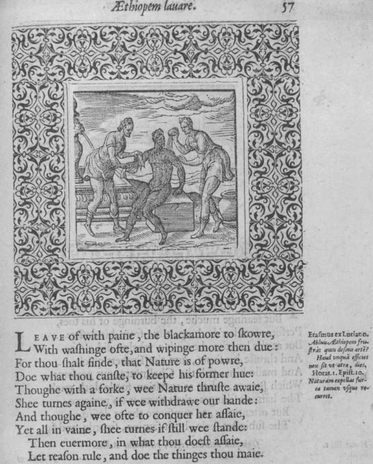
But even avoiding the white line style as a method to illustrate black skin and returning to the more developed black line style does not address the problems with viewing illustrations of black skin, as is clear in the illustration, “Æthiopem lavare,” from Geoffrey Whitney’s A Choice of Emblemes, which shows the common English proverb about the futility of washing an Ethiope white (Fig. 3). In this case, the Ethiope is illustrated in the black line style, but their skin is represented by abundant hatching across their entire body. Hatching is the closely-drawn parallel lines; cross-hatching is when an artist uses two or more layers of hatching at angles to each other. Whereas hatching shows dimensionality, light, and shadow on the other characters and objects in the illustration, hatching only signifies skin color on the Ethiope, thus making them devoid of the dimensionality allowed to the other humans and even objects. And while the technology of the engraving (the other two illustrations were woodcut prints, which tended to allow for less detail than engraved prints) and black line style create a more sophisticated image, the hatched lines across the entirety of the body make it harder to see the body’s details and facial features compared to the bodies whose skin is only partially hatched, and thus lighter-looking.
These three print illustrations — whether woodcut or engraving, in black line or white line style — depict characters with dark skin as defined primarily by their blackness; a blackness that is conflated with lack of dimension and is void of specificity. Such illustrations signal to the white English reader that they need not be concerned about the fact that it is difficult to read detail or emotion in black bodies. After all, these black bodies are not really imagined as individuals: just as they lack visual dimensionality, they also lack affective dimensionality. Because they lack individuality and affective dimensionality, they are not human beings like the white bodies; they do not have access to that ontological status. The black body is difficult to read precisely because it does not really need to be read in detail: it is defined by blackness. White English readers are invited to define themselves, then, in opposition to this blackness; they do not view the illustrated black body to understand or identify with that body, but to distinguish themselves from it so that they can have the dimensionality, individuality, and emotions not afforded to the black body. Whiteness is defined not only by identifying with whites against blackness, but also by identifying with the humanity and ontology of the white individual against the non-humanity and non-ontology of the black body. I borrow the term white feelings — a term popularized by protesters and artists in Black Lives Matter movement — to describe the affective process that occurs when viewing and then rejecting the illustrated black body in order to claim dimensionality, individuality, and emotions. Though the English-as-white racial paradigm does not become fully-fledged until the late seventeenth century and into the eighteenth century, I use white feelings both to signal the beginnings of English whiteness and the rejection of the black text or black illustration.
Early Modern Afro-pessimism and the White Anatomizing Gaze
Bringing to the fore the technical mechanisms that create this affective register, I turn to a black figure in a seventeenth-century print illustration. Unlike the three previous illustrations, this printed anatomy does not depict the figure’s black skin in the white line style or with excessive hatching. However, I argue that this is because the figure’s black skin has been artistically lightened to satisfy the inquisitive demands of the scientific white gaze. Because such lightened skin makes it harder for the illustration to signal to English readers to develop white feelings in opposition to the figure, the illustration’s accompanying description assists in this racial–affective work. Just as the text that accompanied the illustrations from The Spanish Tragedy, Doctor Faustus, and A Choice of Emblemes informed the reader’s interpretation of those illustrations, this same technology of text printed with illustrations maximizes the effect of this double legibility in the anatomy. The interplay between text and illustration teaches the reader first how to identify the figure as non-human, then how to mark oneself as white and English through correctly producing learned emotive responses to the figure, and finally how to erase the provenance of these learned emotive responses by rewriting them as a logical response to the negative emotion that is always already inherent in the non-human black figure.
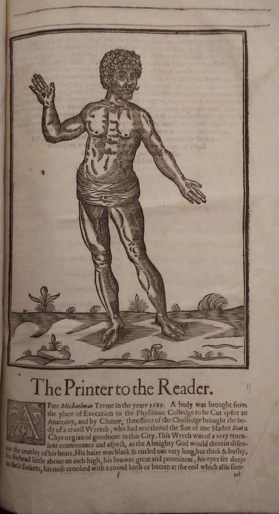
The final pages of the 1631 reprint of Helkiah Crooke’s anatomy, Mikrokosmographia, contain a treatise on surgical instruments. Between the treatise’s title page and preface is an unnumbered section labelled “The Printer to the Reader,” illustrated with a three-quarter page woodcut (Fig. 4). The description begins:
After Michaelmas Term in the year 1629. A body was brought from the place of Execution to the Physicians College to be Cut up for an Anatomy, and by Chance, the officer of the College brought the body of a cruel Wretch, who had murdered the Son of one Master Scot a Chyrurgian of good note in this City. This Wretch was of a very truculent countenance and aspect, as the Almighty God would therein discover the cruelty of his heart.[15]
The passage then goes on to describe the figure’s facial features in racist language — “His hair was black & curled not very long, but thick & bushy, his forehead little above an inch high, his brows great and prominent … his nose crooked with a round knob or button at the end which also somewhat Turned upward … his nether lip was as big as three lips” — that is similar to how later white Europeans would describe the physical features of sub-Saharan black Africans.[16] Of course, as is clear from the illustration, the figure’s skin is not flooded with black ink or covered in hatching to mark it as black. The figure’s skin is heavily hatched and, in some places, cross-hatched. But because in print illustrations, color, shadow, depth, and texture are all represented by black ink lines on a white page, it is difficult to tell whether the hatching and cross-hatching are designed to show dimensionality and detail or whether they are meant to suggest color. One could argue that given the ambiguous hatching in the illustration and the lack of any reference to black skin in the passage, it would be difficult to make a strong case that this is an illustration of a racially black figure, especially because, as Anu Korhonen has argued, the English seemed particularly obsessed with black skin as a racial marker.[17] However, I contend that this illustration shows that the technology and craftsmanship of print illustration, combined with the printed text accompanying the illustration, could also signal blackness as a racial formation without the visual cue of flooding a figure’s skin with ink. The reason why this figure has such detail — as shown previously, details that are not present in many other depictions of figures with dark skin — is because of the gaze that directs the text, a gaze that requires a high level of detail to carry out its racist, pseudoscientific reading of the figure.
The shift in considering black racial formation beyond blackness as a color is relevant precisely because the illustration appears in an anatomical text, which presumes a scientific, anatomizing gaze. The anatomizing gaze had undergone a seismic shift in the sixteenth century. In De Fabrica, Andreas Vesalius had rejected the old Galenic model of anatomy that drew many of its conclusions about the human body from dissections of animal bodies in favor of a new model of anatomy that conducted dissections on human bodies and was interested in the human as a species apart. Although non-human others still appeared sporadically in early modern anatomies, they were increasingly used to emphasize differences, rather than similarities, between humans and non-human others. This means that one of the first moves of the anatomizing gaze is to decide whether to categorize a body as a human or a non-human other. Given the language of the passage that describes the figure — “deformity” is mentioned multiple times and later in the passage, the figure is called a “monstrous shape” and “prodigious” — it appears that the anatomizing gaze persuades the reader to doubt the figure’s humanity. Rather than categorizing the figure as a human with some distinctive physical features, the anatomy’s language of monstrosity categorizes the entire figure as a non-human deformity; a “shape,” not a person. In this way, the figure is similar to the three print illustrations of black bodies discussed earlier: in all cases, the reader is encouraged to position themself in opposition to these non-human others not simply to maintain a white English identity against a racial other, but more importantly, to maintain their ontological status as a human in the face of a non-human other.
Because the history of print makes invisible its complicity in the dehumanization of black personhood, its history needs to be interrogated by newer forms of analysis. To theorize these antagonistic encounters between white English readers and print illustrations of black bodies, I turn to Afro-pessimist philosophy. One of the foundational logics of Afro-pessimism is that anti-black violence is not a failure of civil society; rather, civil society depends on and is structured by anti-black violence. This irreconcilable antagonism between civil society and blackness further exposes that the human is not a universal given, but rather an ontological position that defines itself against black sentient flesh. Here I shift my terms from black body to use the Afro-pessimistic term black sentient flesh, which denotes a shift away from understanding race as a matter of identity and experience to understanding race as ontological and paradigmatic positionality; that is to say, Afro-pessimist claims can be better understood along the axis of human/black rather than the axis of white/non-white. This is not to affirm a kind of scientific or biological essentialism, but to question the human as a universal given, to show how the human is a constructed position and how humanity, in the words of Patrice Douglass, Selamawit D. Terrefe, and Frank B. Wilderson is “made legible through the irreconcilable distinction between humans and blackness.”[18] I also want to draw attention to my use of the word figure to describe the subject of the illustration, as figure simultaneously attends to the ontological positionality of black sentient flesh as not human and not a body, and to the subject as an artistic representation.
Afro-pessimism and early modern studies have not often crossed paths. This is partially because of disciplinary boundaries: Afro-pessimists have often focused on the Middle Passage, the enslaved’s journey in slave ships across the Atlantic to the Americas, as the originary rupture between blackness and humanity that positioned the black as an a priori slave and not a human. As a result — and I acknowledge this is a generalization — Afro-pessimist research tends to focus on anti-black racism after the beginning of the transatlantic slave trade, tracing the African diaspora from the African continent to the Americas. Early modernists have typically considered these matters as outside of the purview of their chronological or national and regional bounds. Nonetheless, early modernists such as Kim F. Hall and Matthieu Chapman, as well as historians like Jennifer Morgan, have begun reaching across this disciplinary divide. In Anti-Black Racism in Early Modern English Drama, Chapman argues that “anti-black racism existed within the [English] subject based strictly on concepts of blackness before encounters with black Africans. [This] repositions the ontological rupture between blackness and humanity, which Saidiya Hartman originates on the slave ship, to an a priori, always already condition.”[19] Under Chapman’s formulation, it is the growth of anti-blackness based on concepts of blackness, and the fetishization of the human in early modern England, that ruptures blackness from humanity. In other words, it seems unlikely that black Africans would have been subjected to the horrors of slavery and the Middle Passage if Europeans had not already defined them as non-humans and enemies to civil society. This essay traces a portion of this subjection in the growing print industry and its investments in racial formation.
Chapman’s work focuses on the interplay between early modern anti-black racism and performances of blackness on the English stage. I extend Chapman’s formulation of the Afro-pessimistic early modern to the genres of anatomy and print illustrations. My application of Afro-pessimistic analysis intervenes in two ways. First, insofar as early modern anatomies are preoccupied with defending and defining the boundaries of the human, Afro-pessimistic analysis reveals the ontological precepts that underwrite racial subjection. Likewise, insofar as print illustrations conjure images of black sentient flesh for the English reader to define themselves against in order to assure themselves of their own humanity, Afro-pessimistic analysis reveals the ways the black/white binary of print and print illustrations primes a black vs. human antagonism. How does the printed text and illustration work together to teach the reader to distinguish this figure as something apart from the other humans represented in the anatomy and the chirurgical treatise? First, we may consider that, like the other bodies represented in the anatomy, he appears alive, despite the fact that, according to the description, he had been executed before arriving at the Physician’s College. For the other anatomical bodies, liveliness is a way of managing the reader’s affects: the otherwise horrifying specter of mutilated, dissected flesh is mitigated through the calm, passively open bodies, who appear to welcome their own anatomizing, gladly giving up their bodies to the pursuit of scientific knowledge. Yet this figure is not in the process of being dissected or marked for dissection like the other bodies in the anatomy, nor is he in the process of being wounded or healed, like the bodies in the chirurgical treatise. What these other bodies have is a divide between interiority and exteriority, the idea that the human body has an interior that can be opened to reveal truth and knowledge about it. The illustration of the figure does not gesture to any kind of interiority; like the other black beings in the previously discussed illustrations, he does not have any kind of personal or individual dimensionality. Rather, he is more akin to the monsters who sometimes appear at the end of early modern anatomies and chirurgical treatises: they are shown un-dissected, suggesting that one does not need to access their interiority to gain knowledge about them; everything necessary to know about them is shown on their surface. Hence the name monster, from the Latin monstrare, to show or demonstrate. The figure’s visual similarity to that of the anatomical monster is also reaffirmed by the categorization of his feet as a major deformity and his face as a lesser deformity in the description: “Such was his face, but the greatest deformity was in his feet.”[20] This language encourages the reader to see the figure’s flesh not simply as harmless physical anomalies or evidence of a spectrum of human difference, but as a sign to mark him apart from humans.
I have shown that this figure can be categorized with non-human others such as monsters, but can the figure be categorized specifically as non-human black sentient flesh? Part of the Afro-pessimistic definition of the enslaved — and therefore, the black — is the gratuitous violence to which they are subjected, violence that is not contingent on any kind of transgression (perceived or otherwise) but is always present. One might object that the execution and dissection of the black figure is contingent on the murder of the Son, yet the passage’s intense focus on the figure’s flesh as an outward sign of an a priori wicked, evil mind and comparative lack of interest in the actual murder belies this claim (consider the artistic detail of the print and the fact that this print is the largest illustration of a single figure in the entire text; this focus on the visual asks the reader to focus on the figure’s flesh, not his actions). The murder of the Son is not the event that justifies the violence, it simply proves that the figure was always already an enemy to civil society, proves the danger of letting someone who is so clearly marked with evil roam free. If the violence were contingent on the figure’s alleged criminal act, then the process of dissecting the figure would — like the other anatomical specimens in the text, who were likely based on the bodies of dissected criminals — return the figure to society as a representative body whose anonymity has functioned to distance them from their crime. But this is not the case. The figure has not been distanced from his crime, and the details about him — who he murdered, when he was brought from the executioner, etc. — make his namelessness not a sign of protective anonymity, but a sign that he has no individuality as a human, no relationality to civil society. The other characters mentioned in the passage enjoy membership in incredibly complex, overlapping networks of family, business, government, friendship, and status — consider the multilayered kinship ties enumerated in the phrase “the Son of one Master Scot a Chyrurgian of good note in this City” — but the figure has no name, no heritage, no family. Due to his lack of heritage or kinship, the figure functions on the level of narrative as a force of anti-kinship; his alleged murder of the Son not only appears to threaten the entirety of civil society, but also its futurity.
But showing how the anatomy categorizes the figure as non-human black sentient flesh is incomplete without considering the affective process of reading that trains readers to identify with English whiteness, to develop white feelings. In this case, the illustration and descriptive passage work in concert to discipline the white reader who might see a human here, motivating them to develop white feelings through the shame of misreading. This misreading begins when the white reader is lulled into a sense of calmness and security through the print illustration’s visual tropes. The illustration features a pastoral landscape upon which the figure stands in contrapposto, with most of his weight on right foot. This classical stance bestows the figure with an air of relaxation and places him in a posture of utmost visibility. His palms face the reader, in a gesture of candor; his face, which serenely gazes out at the reader, repeats these themes of relaxation, calmness, and visual openness. These visual tropes present the reader with a figure open for visual consumption, whose tranquil aura encourages a similarly peaceful response from the reader. But the passage upbraids the reader for this (mis)reading:
This monstrous shape of a man I have thought good to cut and have added this relation thereto from certain knowledge; (for there were a thousand witnesses of it) that you may know Almighty God doth sometime set his brand and mark upon wicked men: First that we may know and avoid them: Secondly to shew his detestation of a mind which in his eternal wisdom, he foresaw would be so foul and ulcerated, and finally because so wicked a mind might have a proportionable habitation, to wit, a prodigious and deformed body.[21]
This part of the passage contains the only direct admonition from the printer to the reader: “This monstrous shape of a man I have thought good to cut … that you may know Almighty God doth sometime set his brand and mark upon wicked men.”[22] In this moment of direct address, the reader who might have identified with the figure or simply have interpreted him as non-threatening is shamed for being fooled, for misreading, and for being a bad Christian who cannot see God’s marks upon the wicked. It is this shame that directs the wayward reader from identifying or empathizing with the figure and towards identifying with civil society, formulated here as the “thousand witnesses.” It is this affective process that leads to white feelings; whiteness is confirmed by becoming a witness.
I return to the metaphor at the opening of this essay: bodies are texts and texts are bodies. But if we are to attend seriously to the early modern writers who imagined and reaffirmed the connections between the page, whiteness, and humanness on the one hand, and the connections between ink, blackness, and non-human abject black flesh on the other hand, then we must reread this formulation through an Afro-pessimist lens: bodies are texts and texts are bodies, but black sentient flesh is ink and ink is black sentient flesh. The early modern move to imagine print as an inherently raced material creates a cultural concept of print as always already a technology of race-making, regardless of whether the printed text or illustration can be said to address race overtly. Early modern print and print illustrations are ancestors of modern white supremacy and global anti-blackness; theorizing the entanglement of print and race more fully reveals print’s material role in developing the white emotions, reading practices, and subjectivity that undergirded anti-blackness in early modern England. [23]
- Following Matthieu Chapman and many of the other Afro-pessimist philosophers with whom I engage later in this chapter, I use the lowercase black to refer to Sub-Saharan Africans and the African Diaspora; I also use black to refer to the pigment of ink. In the medium of print, a black figure is often black in both race and pigment, and it is this entanglement that I theorize. On the connection between “black as race and black as pigment” see Miles P. Grier, Reading Black Characters: Atlantic Encounters with Othello 1604–1855 (Charlottesville: University of Virginia Press, forthcoming). ↵
- Thomas Browne, Religio Medici (London: Printed for Andrew Crooke, 1642), 116. ↵
- Claudia Benthien, Skin: On the Cultural Border Between Self and World, trans. Thomas Dunlap (New York: Columbia University Press, 2002), 43–45. ↵
- William Shakespeare, “The Winter’s Tale,” in The Norton Shakespeare, 2nd ed., ed. Stephen Greenblatt, Walter Cohen, Jean E. Howard, and Katharine Eisaman Maus (New York: Norton, 2008), 2.3.99–100. ↵
- Shakespeare, “The Winter’s Tale,” 5.1.123–25. ↵
- To be clear, hand-drawn or hand-painted illustrations in early modern texts and prints were still common. Readers could purchase texts and prints with colorized illustrations (albeit likely at a higher price), or they could arrange for illustrations to be colored and painted after purchase. However, my point is that the vast majority of early modern English print illustrations were encountered first as dark ink lines on a light page, even if they were altered and colorized afterwards. I also want to draw attention to my description of print as dark ink on light pages, rather than the more common description of black ink on a white page. It is true that in the early modern period, printers and paper mills labored to create blacker inks and whiter paper. However, the blackness of ink and the whiteness of paper depended on the quality of materials and the process of combining them. But given that there were so many different recipes for creating ink and paper, it is more accurate to speak of a veritable rainbow of dark inks (some very black, others not) and light pages (some very white, others not), despite the fact that today and in the early modern period, it is common to speak of all dark inks as black and all light pages as white. I will switch to using black ink and white page for the rest of my argument, but only to address their importance as metaphors we live by, metaphors that have, in turn, influenced the creation of racial metaphors about bodies as black and white. For more on this, see Kim F. Hall, “Introduction,” in Things of Darkness: Economies of Race and Gender in Early Modern England (Ithaca, NY: Cornell University Press, 1995), 1–24, in which she argues that metaphors of dark and light, black and white, do not simply signify European aesthetic standards, but rather are powerfully racialized metaphors that influence how early modern English readers thought of themselves as opposed to racial others. As I will discuss later, Miles P. Grier, “Inkface: The Slave Stigma in England’s Early Imperial Imagination,” Scripturalizing the Human: The Written as the Political, ed. Vincent L. Wimbush (London: Routledge, 2015), 193–220, also explores the early modern context of the black/white dichotomy. ↵
- William Shakespeare, “As You Like It,” in The Norton Shakespeare, 2nd ed., ed. Stephen Greenblatt, Walter Cohen, Jean E. Howard, and Katharine Eisaman Maus (New York: Norton, 2008), 4.3.35–38. ↵
- Grier, “Inkface,” 204. ↵
- Grier, “Inkface,” 195 original emphasis. ↵
- Grier, “Inkface,” 201. ↵
- Grier, “Inkface,” 201. ↵
- Edmund Spenser, The Faerie Queene Disposed into XII Bookes, Fashioning Twelue Morall Vertues, (London: Printed by H. L. for Mathew Lownes, 1609), II.iii.24.1–6. ↵
- Thomas Kyd, “The Spanish Tragedy,” in English Renaissance Drama, ed. David Bevington, Lars Engle, Katharine Eisaman Maus, and Eric Rasmussen (New York: Norton, 2002), 2.4.50sd. ↵
- Ian Smith, “The Textile Black Body: Race and ‘shadowed livery’ in The Merchant of Venice,” in The Oxford Handbook of Shakespeare and Embodiment: Gender, Sexuality, and Race, ed. Valerie Traub (Oxford: Oxford University Press, 2016), 170–85. ↵
- “The Printer to the Reader,” in “An Explanation of the Fashion and Use of Three and Fifty Instruments of Chirurgery,” in Mikrokosmographia: A Description of the Body of Man, ed. Helkiah Crooke (London: Printed by Thomas and Richard Cotes, and are to be sold by Michael Sparke, 1631), sig. F1r. “The Printer to the Reader” does not specify its author aside from the title’s claim that this preface is directed to the reader from the printer. There is no printer listed on the title page of surgical treatise, though the title page says that this treatise was printed for Michael Sparke, who was the same bookseller listed on the title page of Mikrokosmosgraphia, in which Thomas and Richard Cotes were listed as printers. I believe it is likely that either Thomas or Richard was eponymous printer of “The Printer to the Reader,” but I have left this preface without an author as authorship cannot be proven. ↵
- “The Printer to the Reader,” sig. F1r–v. ↵
- Anu Korhonen, “Washing the Ethiopian White: Conceptualising Black Skin in Renaissance England,” in Black Africans in Renaissance Europe, ed. T. F. Earle and K. J. P. Lowe (Cambridge: Cambridge University Press, 2005), 94–112. ↵
- Patrice Douglass, Selamawit D. Terrefe, and Frank B. Wilderson, “Afro-pessimism,” Oxford Bibliographies, Oxford University Press, last modified 28 August 2018, https://doi.org/10.1093/OBO/9780190280024-0056. ↵
- Matthieu Chapman, Anti-Black Racism in Early Modern English Drama: The Other “Other” (London: Routledge, 2017), 25. ↵
- “The Printer to the Reader,” sig. F1v. ↵
- “The Printer to the Reader,” sig. F1v. ↵
- “The Printer to the Reader,” sig. F1v emphases added. The cutting that the printer references in the phrase “I have thought good to cut” plays on the similarities between the cutting of a woodblock print and the cutting in an anatomical dissection. However, the kind of cutting that the printer is referring to is not the kind of anatomical cutting that shows a body with interiority and exteriority, but rather the cutting of a woodblock print, in which the figure only exists as an exterior. The passage later hints at the figure’s interior, but the interior is never shown because it is too loathsome. In the end, the marks upon the figure’s exterior erase any need to explore the figure’s interiority or even consider its existence. ↵
- This essay is dedicated to the memory of Professor Brandie R. Siegfried. I would like to thank Kim F. Hall, Arthur L. Little Jr., and Matthieu Chapman for their input on this essay as it developed. ↵
